Saturday, September 17, 2016

Watercolors on the Fly moved to Wordpress!

Here is the new address: https://watercolorsonthefly.wordpress.com

I needed a quicker way to publish photos straight from the phone - since Blogger discontinued their iOS app where you could do it quickly, I stopped blogging. (Which I didn't realize at first, but I started to miss it.) I just tried the Wordpress app for iOS and it works like a charm, so hence this move to Wordpress!

I do like the blogging format - that you can write longer pieces in comparison to Twittr or FaceBook, and that it becomes an archive of sorts. Its handy to find old notes on how to go about things; such as how to properly draw a ribbon, or how to cut a quatrefoil pattern.

Sunday, March 13, 2016

Painting: Sun breaking through the mist #4, Luigi left a sledge

This is the fourth and last painting in the series where the sun is breaking through the mist.
Here, Luigi left a sledge for visitors.


The painting is inspired by the contraptions in Luigi Serafini's Codex Seraphinianus.

If someone visits, who is other than us, perhaps they will know how to use the sledge, and hopefully appreciate the gesture of the gift.


The painting is available at

Watercolour on paper.
Paper: Saunders Extra White.
Paint: Artist grade, MaimeriBlu and Winsor&Newton.


Friday, March 11, 2016

Painting: Sun breaking through the mist #3, Purple Lake

The sun is breaking through the mist over a lake, where the purple trees are reflected in the water. This is the third of the four paintings I made where the sun is breaking through the mist.


The painting is available at:
  • SaatchiArt (the original, and prints)
  • RedBubble (printed on lots of stuff - it looks especially nice on notebooks!)
  • Society6 (printed on rugs and all-over shirts)*


*RedBubble and Society6 are similar services, but since its easier to upload to Redbubble, plus they accept larger files (=better detail in print), I only upload those items to Society6 that Redbubble doesn't print on. If the motive fits the thing in the first place that is.)


Sunday, February 28, 2016

Painting: Sun breaking through the mist #2, Small dog toting human

Here is the second one of the four paintings I made where the sun is breaking through the mist. In a winter landscape a small dog is toting their human.  I made it in January 2016.

I made two paintings that were quite similar - using the same motive and the same paints, but in different formats and on different paper. The first one was in a portrait format in A4/letter size, and on smooth hotpressed paper. This one is smaller, A6 or half a letter paper, in landscape format, and painted on rough watercolour paper. I was convinced that this one, on the rough paper, wouldn't be as good as the one on smooth paper, but now when I look at it I'm not that sure.  I had just bought the smooth paper and maybe expected it to be some kind of salvatioon :).

I've put the original up as available via Saatchi Art, and selected some things on Society6 that the painting can be printed on. This horisontal one went well on mugs and laptop sleeves.

The first one  being in portrait format went better on other things. For example leggings where purple trees start by the feet, and the sun breaking through the mist is up at the legs.

This second one also seems to work on pillows and tote bags:


Friday, February 26, 2016

Painting: Sun breaking through the mist #1, A walk in a winter landscape


I made a series of four paintings where the sun is breaking through the mist. Here is a painting of a winter landscape where a small dog has taken a man for a walk. I made it in December 2015.


The original is available via Saatchi Art (or just drop me a note).
On Society6 it can be printed on lots of different things, such as totebags, stationary cards, clocks, showercurtains and even on leggings!


Sunday, September 13, 2015

Scanning watercolour paintings

The challenge of scanning watercolour paintings are to get the colours in the digital files as close as possible to those of the paper original. If they are true to the original it is possible to print copies of the painting on watercolour paper, a so called gilcee print.

In order to get the best results it is probably best to send the painting to a printshop who both has professional quality scanners and gilcee printers. The printers are very expensive, and so are the scanners, but it is possible to find at least scanners that give quite good results. Many artists recommend the Epson scanners for water colour paintings. 

I got the Epson Perfection 600V. Its not the priciest option, but probably good enough for me. It cost around  300 USD, while the next step up the ladder cost more than double that. It can scan up to an A4 - again getting one that can scan A3 size paintings would have been quite costly. I read on blogs that there are pretty decent stitching functionality in image editing softwares, so for larger paintings one can scan in parts.  

The new scanner is a huge upgrade from the one I had before, a +10 year-old combined colour-ink printer that also had a scanner. Using that, i needed to make a lot of corrections in the colour calibration. I suppose the main use of it was that it made the paintings lay flat down, an improvement from taking a photo, where they always look somewhat crumpled not being held straight by frames. 

Experimenting with settings on the Epson P 699, I got the (so far) best results by turning OFF all the different options in the software, just letting the scanner do its thing. The scans come out slightly cooler in colour than the originals, but perhaps I can work out better settings given some more time fiddling with it. Its also the matter of seeing the scan on a screen (a retina screen on a MacBook Pro in my case), not knowing how much the screen projection changes the colour.

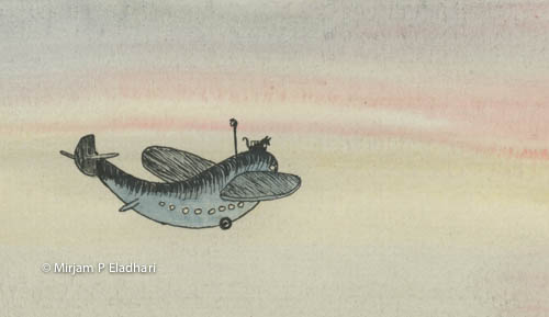
Kissinger on his fly-fish sub

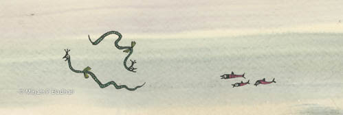
Seacreatures (in shock, because the just saw Kissinger in his fly-fish sub)

Above are some scans. Especially the parts showing the background wash of raw sienna comes out cooler than the original. On the other hand, that might just be how it looks on my screen. 

This is what the scanner looks like:
Epson Perfection 600V

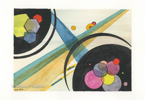
Some nodes of a SAN and an abstract

I have been toying with the idea to represent computational systems and processes in water colour. I did some sketching while looking at paintings by Kandinsky and Picasso, and jotted down the nodes of the MindModule SAN (Spreading Activation Network).

mind-module-scan 2015-09-11-colorfix-3457 x 2322.jpg abstract no 1 August 2015-1-5196 x 3578.jpg

Friday, June 19, 2015

How to use an iPad as a light table

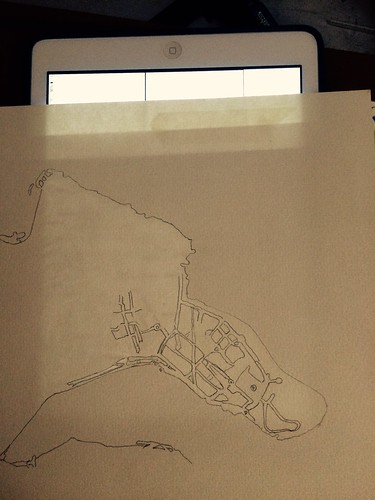
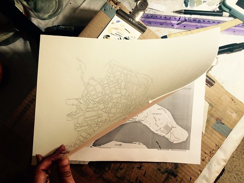
Transferring sketches or detailed motives such as maps to watercolour paper can be done by using backlight from windows. However,  it can be uncomfortable to do it for a long time standing in an awkward position. If you don't want to buy light table, you can use your iPad instead. Its backlight makes it into a perfect, albeit small, light table!

Using an iPad as a light table

The trick is to make sure that the touch is disabled from the screen so that it doesn't switch applications or do other funny things because of the pressure of your pen on it.

In order to disable touch, you need to go into the settings and use 'Guided access'. It is intended for parents want to let their toddlers use the iPad, but to not touch the screen and by mistake stop a movie   (for example). This feature is perfect for painters too.

Do like this to temporarily disable touch from an iPad :
1. Go to 'Settings'
2. Go to 'Accessibility'
3. Go to 'Guided Access' (under the 'Learning' header)
4. Turn Guided Access on. Enter a passcode.
5. Now, you can go to some application that gives a strong backlight, such as an empty page in an e-reader or an empty note. Or, your could display an image on the iPad that you want to trace.
6. Press the home button three times, quickly.
7. Disable 'Touch'. Press start.
8. Viola! Use the iPad as a light table.
9. Enable Touch again by quickly pressing the home button three times, and entering your passcode.


Because the iPad makes a quite small light table, I taped the background image i wanted to use to the back of my watercolour paper. This way, I can move the paper around the surface, and have a larger painting than the size of the iPad otherwise would admit. The paper in the image is 220 gsm, and allows the light to go through both the printed image and the watercolour paper. Thicker paper would be tricky.

Preparing to use a light-table

Useful link:
- A more detailed instruction, with screenshots, on how to disable touch from the iPad, from wikihow.com.


Sunday, June 14, 2015

Colour Wheel with Yellow Deep PY129, Cadmium Red PR108, and Ultramarine PB29

Colour Wheel with Yellow Deep PY129, Cadmium Red PR108, and Ultramarine PB29


Yellow: Permanent Yellow Deep, PY139 - Isiondoline, MaimeriBlu 114.
Red: Cadmium Red Deep, PR108 - Cadmium Sulphoselenide, MaimeriBlu 232.
Blue: French Ultramarine, PB29, Winsor & Newton Prefessional 263.
Paper:  Hahne rough 220 gsm

(A few notes on making a colour wheel are here.)

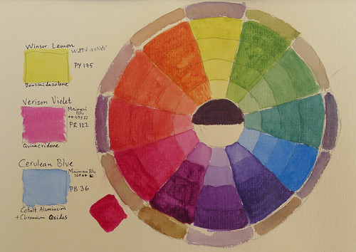
Colour Wheel with Lemon Yellow, Verizon Violet and Cerulean Blue

Colour Wheel with Lemon Yellow, Verizon Violet and Cerulean Blue

Yellow: Winsor Lemon, PY175 - Benzimidazolone yellow , Winsor&Newton Artist 211.
Red: Verizon Violet, PR122 - Quinacridone, MaimeriBlu 437 (equivalent to Alirazin Crimson of other brands). 
Blue: Cerulean Blue, PB36 - Cobalt Aluminum and Chromium Oxides, MaimeriBlu 368. 
Paper: Hahne rough 220 gsm


For making the tonalities of each colour and mix, first lay on a thin wash, on all four central boxes, then glaze it darker and darker, allow it to dry in between.

For making the black in the middle, use a lot of blue, some red, and add a dash of yellow.

The outer circle is showing the shadow colours. For making these, add a dash of the the complimentary color on the opposite side of the circle of the colour you are working with. 

Useful URL:
Paintbasket.com has a great a video tutorial on how to make a colour wheel.

Saturday, June 13, 2015

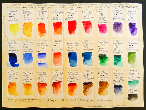
Upgraded Palette of single pigment watercolour paints (MaimeriBlu)

It was time to upgrade my palette. I invested in a larger set of artist grade watercolour paints.
In selecting colours, I had great help from the advice by Bruce McEvoy on the Handprint site in selecting which colours to get. I used the ‘artist’s colour wheel’ to make sure that i have most of the spectrum covered in terms of hues and chroma. My selection is mostly
  • single pigment paints,
  • of the list of ‘top 40’ pigments, and
  • of price group one.
The exceptions to the single-pigment is one blend, Payne’s Grey. I like to use for making dark red-violet clouds by blending it with alizarin crimson or verizon violet (Quinacridone PR122) or mix with earth yellows to make muted dark greens for pines and such.

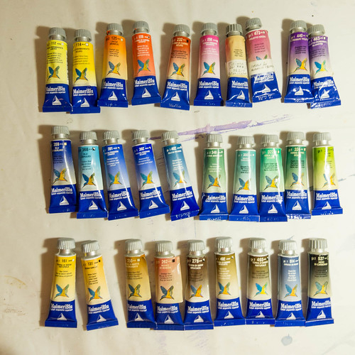
For brand I chose MaimeriBlu, as they are carried by the artist store in my block on Malta in Sliema, and as they are recommended by Handprint. They come in 15 ml tubes, and are, at least in my local shop, less pricey than Schmincke, which is the other brand they carry. The exception for the more pricey pigments are cerulean (PB36) which I got myself, and then my aunt bought me the cadmium reds (PR108), and my friend Lena gifted me the Viridian (PG18) and the Tizian Red (PR209).

I made a color chart with notations of components, lightfastness, opacity/transparency, and granularity. The granularity was not noted on the packaging, so again, I had help from information about granulating pigments at Handprint (links below).

L1170167.jpg
Here are the colours:

watercolour paint selection from MaimeriBlu

Useful links:
The artist’s colour wheel
Granularity (scroll down to the texture section)
List of top 40 pigments
MaimeriBlu Colour Chart


Thursday, April 2, 2015

Brush pen for sketching

I tried making a notan sketch using a sort of pen that is a brush with built in black ink. I liked it! Motive is some guys on pier in Sliema, by the Exiles, in Malta. I used the brush pen on the 100 black bits, and then some watery paynes gray with a watercolor brush. 

Tuesday, January 13, 2015

Water colour tube colours, and developing one's own palette

A few days ago I started to prototype a game by painting interfaces in watercolour. I couldn't find my pan of Cerulean, and realised it was probably in a small water colour set that I gifted to my aunt in the autumn. I needed to go get a new one from the art store.

This led straight down the rabbit hole.
I've geeked out for days on pigments for paints, different brands, how to compose a palette that suits how I want to paint, and how to mix colours.

Mixing darks


When I first started painting about two years ago I read up on color theory, and found good introductions at
about.com,
watercolorpaintingandprojects.com, and
paintbasket.com.
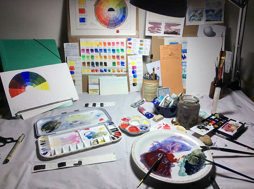
Back then I ordered a large set of student quality paints (Cotmans from W&N) in order to get to know the different colours. The set of swatches by my desk in the middle of the the picture above is the one I have been referring to while painting at home.

Since then, I have been successively replacing my student quality pans - first with artist quality pans, and now with tubes of artist quality watercolour paint. These are expensive, so one needs to do the homework before cashing out.
For more in depth information about watercolour pigments I found the amazing Handprint.com. It is a treasure trove of data about the pigments. After reading up on cerulean I got inspired to revisit color theory, and to start thinking about what palette of my own have - i.e., which tubes to get in addition to the cerulean.

The amount of information that Bruce MacEvoy gives on his site is massive, detailed and well structured. I have been engrossed in it for days. I'm thinking of sending him flowers.

This is what i learned:
1. Focus on the pigment - not the name the colour is given by the manufacturer.

2. For each colour one need to get, refer to MacEvoys tests on lightfastness and other criteria before buying something. Here is an amazingly useful [chart]. First pick the color, and on the next page, pick the pigment. This leads to a list of test data for using the different paints.

3. Brand - it seems like the safe options to pick when one does not have time to do research is to get Winsor&Newton or Daniel Smith, but they are expensive. If MaimeriBlu has the needed pigment they are less costly, and still of excellent quality according to BMs tests.

4. BM recommends a minimal and [basic palette] - for me, this seems a great way to start. I was about to get a medium red pan (winsor red) in tube, but I learned that if one only is to have one, its better to choose a [magenta] one, because they mix better with other colours, and its still possible to make warm reds with the yellow.

Yesterday morning I went to the art store as soon as they opened, and found that they indeed had MaimeriBlu, and I got the Cerulean despite it was expensive (14 €), and the Verison Violet (4.5 €), which Bruce MacEvoy recommends to get instead of Alirazin Crimson, (the pigment in Verison Violet doesn't fade as quickly).

Now I have the pleasure of revisiting making a colour wheel and trying out different mixes of dark, but now with better quality paint, and also, with more sense of purpose. Since the last time around I've realised that painting in water colour isn't just something I'm exploring a little bit - life would be less fun without it. The potential for geekery and skill development can last a lifetime, and I just got started.

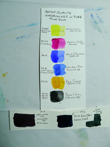
Here is my first tiny choice of artist quality tubes:
Palette 1 Artist Quality mixed tubes

This is what the swatches looks like. To the left of the watches are the IDs of the pigments, to the right I note the brand and name of the color.
L1170111.jpg


Friday, December 5, 2014

Sunday, September 21, 2014

Painting boats

I love boats. Ships, vessels, yachts, or whatever the name of a particular one. Chance has been that I have spent most of my life living close to water and harbours, albeit different ones. So, boats tend to be around me, and because I like looking at them,  they are one of the first things  I want to learn to draw and paint.

Having sailed some, and being fascinated by blue prints for boats, I know a little about their construction. That doesn't help me though.  Instead, I tend to want to draw what I believe that the boat should look like. When I can free myself from that, and just see the boat, and not even think about it as a boat, it works much better. Then, I just see the shapes and the relations between them.  Like in the picture below.
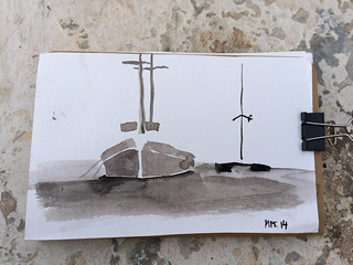
IMG_1634.jpg
A picture I made when taking a break walking to work
 in February 2014.  At the time, I was practicing
making "notan" pictures. The sport being to use only one color
and three tones: white, medium, and dark. I was looking at
Fernandes II, a wooden gullet built in Turkey.  
Summertime on Malta, she carries tourists  
from Sliema to the blue lagoon in Gozo.
At her side is The Sprit of Malta, a catamaran. 

If that's all that's needed, to not think about them as boats, then how come many books on how to paint have a little section about boats? If its just a shape like everything else, then why bother?

What I have found useful in books is how to work the technique. How to not overwork it for example. I tend to want to put in all the rigging in sailing boats, but when I look at painting of boats in books, they are often reduced in detail, and the rigging is not there. For me, a good lesson is to look at the paintings in the instruction books and note what detail they have kept and what they have omitted, and with very few brush strokes still make it look like a boat.

Another thing is to put some effort into the reflection of the boat in the water surface. It looks much better with a reflection there, at least to my eyes.

To practice, I am copying paintings of boats in books, and then I practice more by looking at boats in the wild, and paint them too.

Below are two pictures I made when I looking at a painting of a boat in the little gem of a book 10-minute Watercolours. I made the third while looking at a drawing in Tove Janssons' book Trollkarlens Hatt (edition in Swedish, p.102).
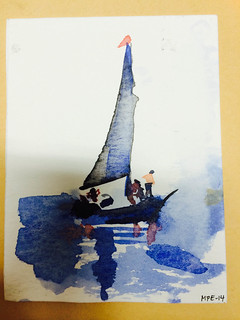
IMG_1638-2.jpg IMG_1637.jpg

IMG_0954.jpg

 Photos are a treasure trove for looking at boats from the past. This summer, we visited Pommern, a windjammer turned into a museum ship. It was one of the last sailing ships in use for carrying cargo. Being on board is amazing, she is massive. In the little information folder I was given was a black and white photo of her with the sails set. I looked at it when I did the image below. (I was very pleased with that I had remembered to take the folder. The word "reference image" echoed in my head. It feels so nice to be someone who would have a use of such a thing. A reference image.)
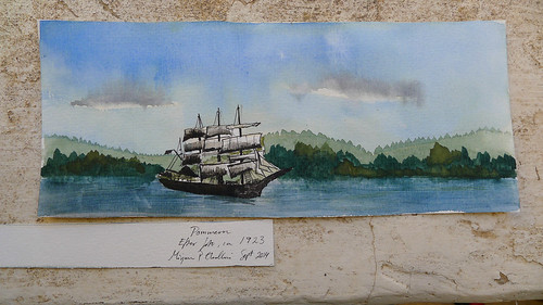
Watercolour of Pommern

I wasn't terribly pleased with the resulting image, so I won't send it to anyone (if I'm not too ashamed of the picture I give it to someone, or send it as a post card).  I will glue this image onto a can, so that it can become a pencil holder. I made sure that the paper had the right measurements, and that the trees align somewhat on the sides. (Much less presumptuous to give someone. "Look, here is an old can! You can put pens or some other rubbish in it! Yeah, I glued a picture to it. Don't worry about that.")

I plan to portray my dads boat, Evnig. I have a resistance to it for some reason, perhaps because it is not just any boat, a collection of shapes, but a home of sorts, and a friend. Thus, a difficult motive. When I think of her, I feel how the deck is warm under my hand. For now, I am collecting images of her. I expect to make many attempts before I can produce something that won't be painful to see. (or so I hope)

Summary of how I try to learn to paint pictures of boats:
  • Draw the shape I see, not the one I believe should be there
  • Reduce detail
  • Don't forget the reflection in the water surface
  • Practice: paint while looking at:
    • other painting of boats. One learn what details need to be there, and which can be omitted.
    • real boats. Harbours with benches are good places for that. 
    • photos of real boats. So much less wind/sun/rain onto self. Also, less bobbing about in the waves (of the boat). 

Saturday, September 20, 2014

Painting with a Hake Brush

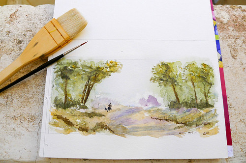
I'm learning to paint with a hake brush, which is a big blob of goat hair. It is amazing what detail it is possible to paint with such a seemingly unwieldy thing! In the image below, the only thing i painted with a small brush is the walking figure.

Painting with a hake brush

The above picture is not my first attempt. The first was a miserable thing.

I was doing exercises from Ron Ransons' book Watercolours - one of his signums is the use of the hake brush.
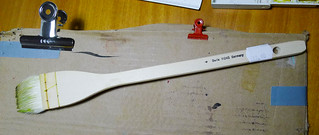
A short flat broad thing. This is the brush I used:

Moddler brush

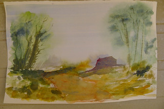
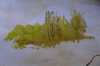
I doggedly made tree trunks, foliage and undergrowth as told in the book. I made some half ovals (they can become beaches). It didn't go well, not at all. I didn't become desperate until I tried to copy the image with trees in the book. It seemed impossible! Frustrated, I reached for other brushes, trying to save the picture but, it was forfeit.  Here it is:

Fail: a moddler is not a Hake

I started looking closer at the picture of the hake brush in the book. I remembered seeing something similar in the local art-shop, one of the many things in there that are mysterious. Had I been using the wrong brush?
I brought the book to the art store, so I could compare in situ.
Here is what I found:

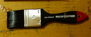
Hake Brush, 38 mm, DaVinci

What I had been using is called a moddler brush!
I made the exercises all over again - this was something else! Making foliage was insantenous, just a few dabs (see below).

Practise with a hake brush

When the hake has the 'right' amount of water and pigment in it, it is surprising what detail one can produce. But getting that balance is something that I will have to practice: with too much water and too little pigment it doesn't go well at all. In his book Ranson talks about the necessity of having an abundance of rags at hand. This is for taking out the water from the hake brush. In a video I saw that he was holding a hand towel as a rag in the left hand while he painted. I'll try that.

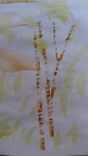
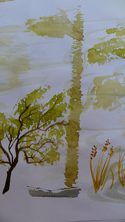
There was one thing that moddler brush was great for though, better than the hake: to easily make tree trunks. Below, the trunk in the image to the right is done with a moddler (40 mm), and the one to the left is done with a hake (38 mm).


making a tree trunk with a moddler
Trunk done with Moddler
making a tree trunk with the hake
Trunk inexpertly dabbled with a Hake


In summary:

  • Make sure the brush is actually a hake brush, not some random object that display similarities.
  • One must have a rag in the other hand to remove excess water from the hake when painting.
  • A pro of  the hake brush is that it helps making shapes as they look like in landscapes.
  • A con is that  it is difficult to get the balance right with amount of water it holds. But that might be different once one learn to master it. 

Thursday, September 18, 2014

Introducing the blog!

Hello,
and welcome to this blog about watercolour painting! My name is Mirjam Palosaari Eladhari. I am a researcher and lecturer in game design and artificial intelligence. I use watercolour painting as a way to relax and to recharge. For me,  one part of the joy is that the activity itself is so forgiving in that it is so quick, and that in that I am allowed to fail as much as I want. If a little painting is ugly: so what, it only took 10 minutes to make, and I don't have to show it to anyone.

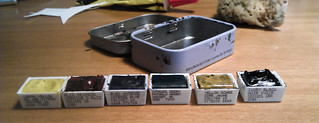
In my handbag, I keep a tiny pillbox with 6 half-pans of watercolour, and a water brush. Tucked into the notebook, a have small pieces of watercolour paper. With that, I can paint anywhere, if i have a moment for it. Such as on a flight, or waiting for a friend who is late.

At work, I too have colours, some brushes and paper. It is like magic to do a little bit of painting if i feel stuck in my thoughts, especially if I am programming, or if I am writing a paper. Ten minutes is all I need. As the brain shifts activities it is like somethings loosens up, and I can see new perspectives and solutions.

Even, some mornings, when things feel bleak, the thought that I will be able to paint for at least 15 minutes sometime during the day is enough to coax me out of bed.

I started dabbling with the watercolours in the summer of 2012. My husband and I had just moved from Sweden to Malta, and in one of the moving boxes I found my old painting materials, leftovers from...it must have been the art lessons in the gymnasium (equivalent of college/highschool). Despite having been untouched for more than 20 years, they were still usable.

I approach watercolour painting and sketching as the complete novice that I am. Some things are surprisingly easy to learn, other things one would need a decade to practise. That's OK. If the future holds years of painting and sketching practice - all the better! I never want this to end.

Welcome to the blog! Please feel free to comment and to share your thoughts.

Mirjam


PS. Here is a picture of my little travel set for watercolour painting on the fly! It is a pill box of metal. It has its little mixing space, and the metal of it sticks to the magnet in my handbag. This is especially handy if I am at a conference, listening in a chair and don't have anywhere to put anything. I just put the box on the handbag in my lap, hold the paper in my left hand, and the watercolour brush in the right one.

cool colour mini painting kit

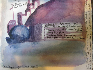
...and here is an example of a note from a conference: I write with a pen that has waterproof ink, so that it doesn't smudge:
FDG 2014 water color notes day 2-2